We Look Beyond the Obvious with This What Online Shoppers Want Survey…
The age-old question in marketing/advertising, what do the people want? Every business asks themselves this. Whether you’re selling a product, service or looking to engage readers, it’s vital that you’re always asking this question. Asking questions is what spawns growth, evolution, innovation and change, and that’s exactly what you want to do with your business.
We had a curiosity regarding what online shoppers want, so we asked a couple questions ourselves.
We conducted two surveys garnering 400 responses. In the first survey, we asked the question “When buying a product online, what information or features do you want to see on the website you’re purchasing from?” and the responses were overwhelmingly focused on two things – price and reviews. Not surprising I’m sure.
So, we ran a second survey to drill down and find out what other things customers care about. We asked online users “Besides reviews and price, what information or features do you want to see on the website you’re purchasing from?” Here is what we found out:
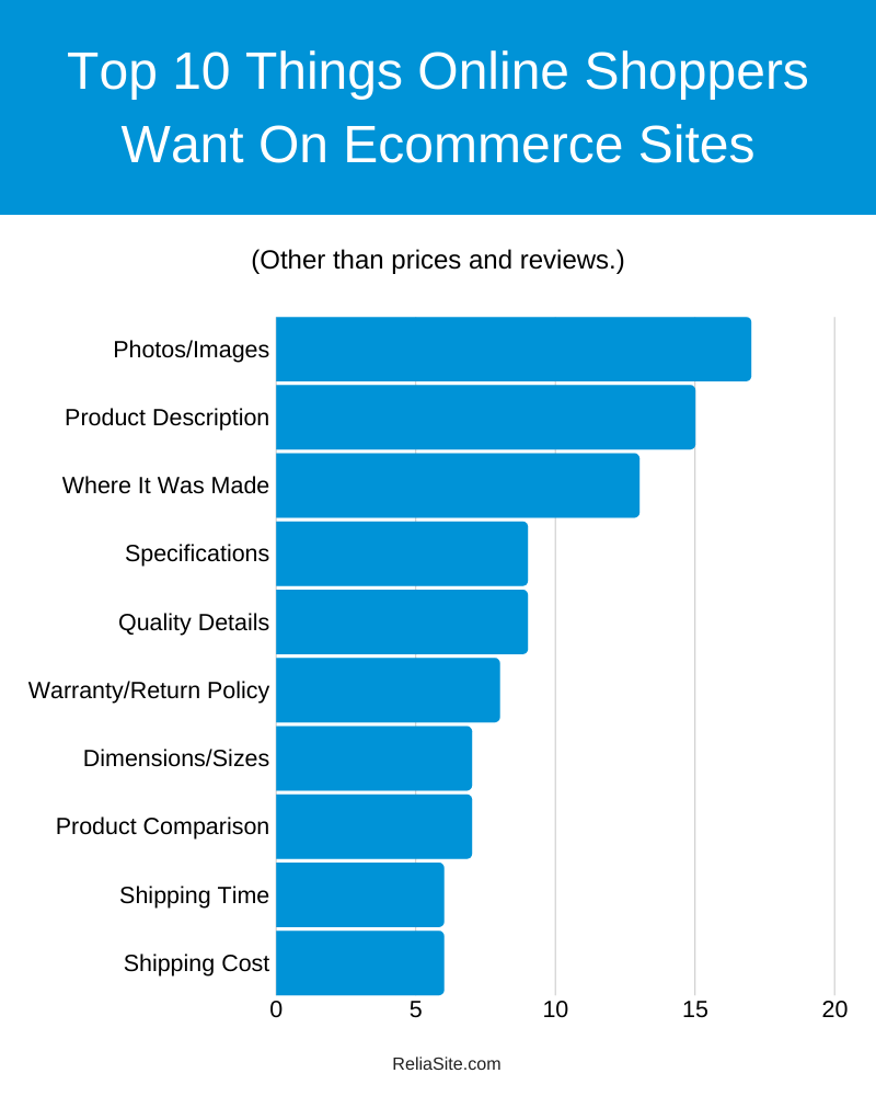
What Online Shoppers Want Survey: 17% of Respondents Answered “Photos/Images”
You might call this one obvious as well but we dug a little deeper on what users were looking for from images and it was quite telling. Statements like “accurate photos” or “real customers using the product photos” showed us online shoppers want a versatile set of photos. So, it’s best not to get lazy and post 2-3 photos. Give 10-12 thoughtful photos that give the user a comprehensive look at your product.
Take a look at the two screenshots below. The first is a screenshot of Papa John’s online menu, the second is screenshot of a local pizza restaurant’s online menu.
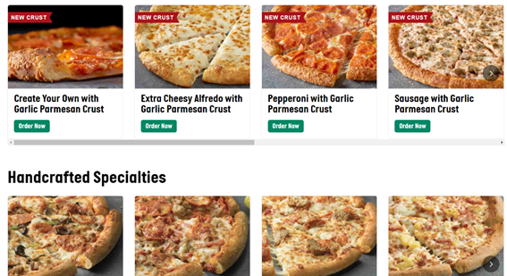
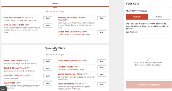
I’m never one to knock local pizza but just looking at this from a pure user experience point of view, the images make a big difference. The local shop has a pretty simple checkout process, prices are easy to find and there are plenty of places online to find reviews these days but why make it so hard to see the dang pizzas! Why send users searching around the web for your food? There are maybe three images on their whole site.
This is an example of images making a difference.
Takeaway: Have a large number of images covering multiple points of view and serving various purposes IE someone using the product or demonstrating how it works.
What Online Shoppers Want Survey: 15% of Respondents Answered “Product Description”
As a writer myself, this one made me smile. Lost in the shuffle of video, images, reviews and so on is the art of selling with the written word. It makes a difference. You don’t need pages of content (unless the reader asks for it) but don’t sell the written word short. Think of a user experiences like hitting all 5 senses. You want to touch as many as you can. Eloquently and tactfully selling the product with product descriptions is another chance for you to hit a difference virtual sense (in addition to all the other ways).
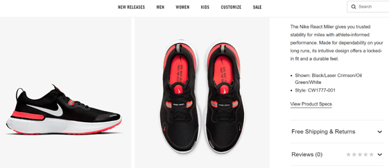
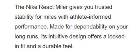
Below is a screenshot of a random pair of shoes from Nike.com. Often revered for their marketing prowess, Nike doesn’t disappoint here. In this screenshot, which is maybe 1/3 of the product page, you see many areas we’ve discussed or will discuss all in one tightly knit package. You see images, reviews and specs readily available, but what I want you to pay attention to is the copy.
Concise, descriptive, sexy. It’s not the end all be all, but it adds to the page and after reading it, I for one am more inclined to purchase the shoes.
Takeaway: Invest in the written word (however short or long) and make the words on the page count and not offer the bare minimum.
What Online Shoppers Want Survey: 13% of Respondents Answered “Where It Was Made”
Some of the answers specified they were looking for USA-made products or products “not from China” (which could be a product of the times with everything going on), but most just stated “where it was made.” I did some digging on this subject to see why this was important to people. Based off the answers, I’d say this is a reflection of an ongoing issue with offshore manufacturers.
Some offshore manufactures in certain areas have become notorious for gaming ecommerce sites (namely Amazon) to improve the sales of their product. Their scheme consists of creating a new brand front, posting counterfeit products (such as a premium underwater camera or smart phone) and then populating their product pages with fake 5-star reviews leading to many paying customers getting tricked and left with low quality products.
With ongoing issues like that, it’s easy to see why online shoppers care so much about knowing where products are made. Take a look at the screenshot below to see a good example of how to prominently display where the product was made.
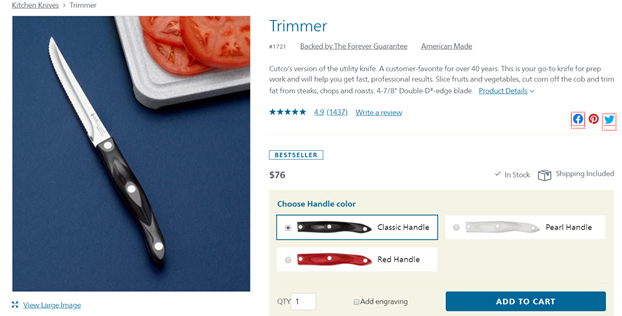
Takeaway: When listing products, be transparent and display where your products are made.
What Online Shoppers Want Survey: 9% of Respondents Answered “Specs”
Specs (or specifications) are typically a list of details about the product. They’ll cover items such as size, measurements, materials, color, shape, among many other tangible details. Specs are important to showcase no matter what industry you’re in. It doesn’t have to be the first thing users see on your product page, but you should give the option for users to view the specs.
To give an example of the utilization of specs regardless of industry, take a look below.
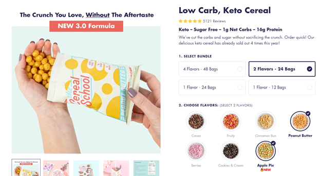
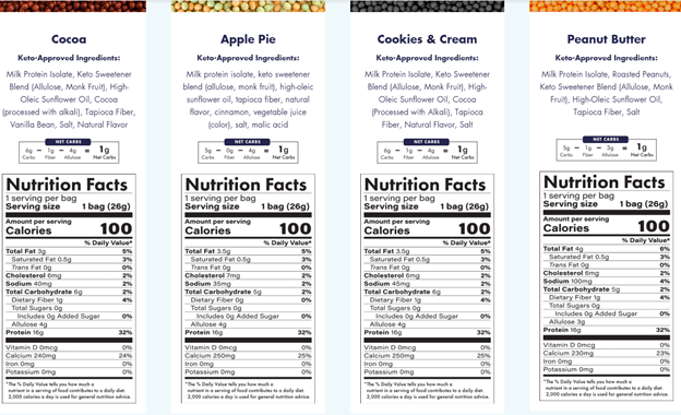
On this product page for healthy protein-packed cereal, you have no issue reviewing the specs (or details) of their products. You see your options with how many bags/flavors, you see all the flavors they offer and then once you scroll down you’ll find ingredients (which also showed up a couple times in our survey results) and then the food label aka food specifications. A great example of a clean layout that makes all specs easy to find and understand.
Takeaway: No matter your industry, make your specs available and accurate.
What Online Shoppers Want Survey: 7% of Respondents Answered “Dimensions/Sizes”
These next two fall under the “specs umbrella.” Even so, they are worthy of being their own categories, and the fact that our respondents specified them as their most important piece of information after reviews/price speaks to that. Clearly, if you’re buying clothes or jewelry, you need to know the sizes/dimensions, but as we stated in the last section, no matter the product – customers want to know the specs so don’t make them hunt to find it.
There are many ways to showcase the sizes/dimensions of items, such as a sizing chart or an image that gives an accurate perspective of the size of the product. A clever way I’ve seen ecommerce websites help users buy the right ring size is with a printable ring sizing chart that lets you place a ring on various circles to find the size. This especially helpful when buying a gift for someone who you aren’t sure what their size is and you don’t want to directly ask them.
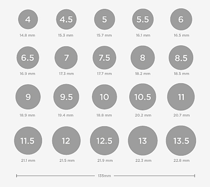
Takeaway: Go the extra mile when helping users figure out the sizes of your product or the size that fits them.
What Online Shoppers Want Survey: 3% of Respondents Answered “Color”
Once again, thus falls under specs but the fact that our respondents specified its importance says it’s an item that shouldn’t be buried in the middle of your list of specs. I mean, I could not think of anything much more frustrating than finding the product you want but struggling to figure out what color the product actually is or what colors it’s available in.
Dick’s Sporting Goods does a good job making sure you know the color of the item you’re purchasing. They even let you browse and visually see the different variations of the colors before you even have to click on a product.
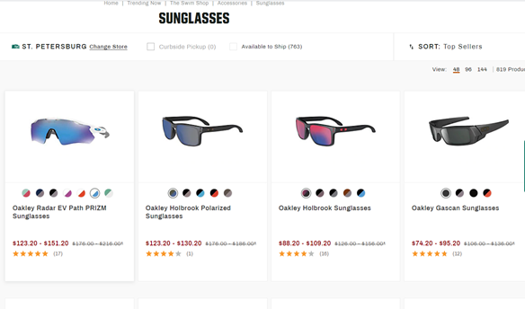
Takeaway: Know what specs matter to your users and make it easy for them to find/browse through.
What Online Shoppers Want Survey: 9% of Respondents Answered “Quality”
This is a bit of a vague response – “quality.” Obviously, as we stated, reviews are huge and leaned on to provide an honest look at a product’s quality. Well, you can’t always control reviews (especially since most users turn to 3rd party websites for reviews) but there is something you can try to control – its something known as “quality control.” Quality control is basically a process or system used to test and sample a group of products to ensure they met requirements and specifications. In layman’s terms, it means to make sure the stuff you put is as advertised and up to snuff.
As we said, you can’t control reviews, but you can control the product you sell. Ensuring that you do everything as a business to deliver quality products is the preventative maintenance that may be more effective than any promotional material you put out there.
Another area that can affect if users view your product as quality or not is the customer service you offer your existing customers. If you don’t want bad reviews or your name to be vilified via word of mouth, treat your customers with respect! Be available, have contingency plans to resolve common and uncommon problems and have a high standard for how your reps interact with your customers.
Another area you can use to showcase quality is with your multimedia and marketing concepts. Use videos that look professional and demonstrate your product is of topnotch quality. A great example of this is the video marketing concept “Will It Blend?” that BlendTec used. They blended all kinds of insane items in their blender to show its strength. Not only did it show off the quality of the product, but it turned into a viral hit garnering tons of attention to their product.
Takeaway: If you want users to view you as quality, only put out quality… in everything your company does IE product quality control, customer service and multimedia.
What Online Shoppers Want Survey: 8% of Respondents Answered “Warranty/Return Policy”
This once again falls back onto how you treat your customers. It’s also an indication to:
- Offer some type of return policy/warranty.
- Ensure that it’s visible to your users during their shopping experience and easy to understand.
- And most importantly, honored!
According to Think with Google, “83% of shoppers surveyed say the ability to make easy returns is important to them when deciding which brand or retailer to buy from.” This once again validates our three points above.
If you’re looking for a good example, take a look at the screenshot below. Macy’s is known to be fair and lenient with their return policy. You’ll see they have a section dedicated to it right there on their product page. It’s clear, easy to find and offers the option to learn more about it.
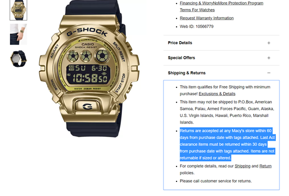
Takeaway: Be thoughtful, clear and consistent with your return policy/warranty.
What Online Shoppers Want Survey: 7% of Respondents Answered “Product Comparison”
It’s best practice to do product comparisons when shopping (especially online where it’s so easy to jump from vendor to vendor). Knowing this, it’d be worth considering doing the leg work for your users and offer product comparisons for them. This at least gives you a chance to control the narrative a bit. A few guidelines when doing this:
- Be honest and accurate. That means keeping up with the latest prices and updating your site.
- Only do this if you’re confident your prices beat the competition (in other words don’t do this if it makes you look bad).
This insight also applies if you’re a reseller. Once again, this is going the extra mile to provide the best user experience possible. Doing the leg work for your users and providing a product comparison for them will be appreciated. You’ll see in the screenshot below, SSL provider The SSL Store offers a comprehensive and well-organized product comparison chart for a few of the brands they provide on their website.
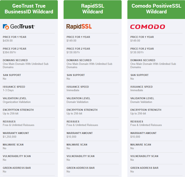
Takeaway: Do the leg work for your users when it comes to product comparisons (if applicable).
What Online Shoppers Want Survey: 6% of Respondents Answered “Availability/How Long It Takes to be Shipped”
Another example of the importance of full transparency and clear information. According to Think with Google, “44% of shoppers surveyed wish retailers would do a better job of sharing inventory information.” That’s a pretty big number of people who feel they aren’t getting enough information on what is available to them. Couple that with a total of 6% stating “availability/how long it takes to be shipped” is most important after price and reviews, and we see this as a worthy insight.
This tells us, you should be clear and transparent about these areas during the checkout process:
- The wealth of your inventory.
- What is the legitimate time-frame it will take for customers to receive their purchase.
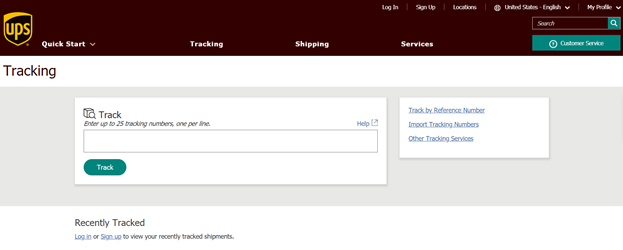
Obviously, there is maybe no better example of this than the big shipping companies, such as UPS. I mean, every package gets a number and all you need to do is pump that thing into their track your package page, and bang, you literally see every step your package takes.
Takeaway: Be honest and clear with your inventory availability and shipping process.
6% of Respondents Answered “Shipping”
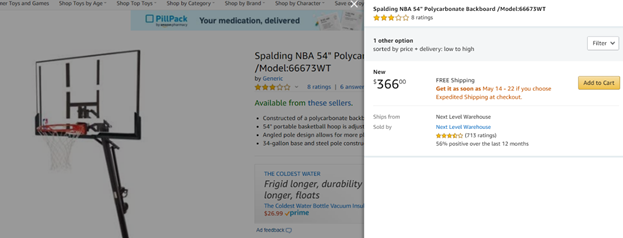
Based off the responses we got for shipping (such as “shipping cost” or “shipping fees”) are respondents found a loophole to comment on the importance of price, but we still feel this is a worthy insight. There seems to be a theme here. Online shoppers want the fully story on the product their buying and they want it to be a story that is easy to read. No hidden fees, no missing specs, no “why can’t I find the color?” Make your product page comprehensive, easy to navigate and accurate.
And oh yeah, when you say free shipping, make sure it’s FREE shipping!
Takeway: No hidden shipping fees and don’t make users jump through hoops to know the final price of their product.
There you have it, our What Online Shoppers Want survey results and insights. If this survey provides anything, it could be used as one large checklist when constructing your online shopping user experience. Best of luck!


