Answering the Question “What Are the Key Elements of a Good Website?” and How to Include Them in Your Site…
“This is a good website.” That’s what you want to hear when you create a website. And it’s great when someone qualifies your website as “good,” but it does leave you with a bit of a nebulous compliment. It begs the question, what are the key elements of a good website?
In this article I break down the most crucial elements of a good website, how they affect the user experience (UX) and some tips on how to implement them into your own site.
A Website That Has a Purpose
Purpose may seem like an odd choice for a key website element but hear me out.
When you begin the task of building a website (whether you are building it yourself or you hired someone to do it, and you’re managing the project), it’s a bit of a journey to embark on. It’s important to start this journey on the right foot. That right foot is knowing the purpose of the website.
Don’t go into it blind or lacking information, this will only lead to more work, money, time, etc. Is this going to be an ecommerce site? Do you need to have users schedule appointments? Is this a website that will need a lot of pages or subdomains? How will you market the website? Will you need a blog for SEO?
All of these are important questions to answer. And the reason a website with a purpose is a key element of a good website is because when you start with a clear direction that leads to the destination of a website that has a clean and clear user experience. Having a clear purpose is the foundation that allows you to establish and deliver a “good” website.
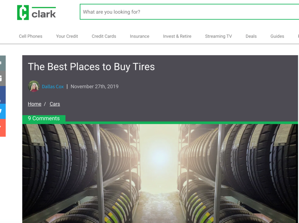
If you’re looking for suggestions on how to determine the purpose of your website, I recommend checking out the blog below. It’s built for asking website-related questions to a client, but they are questions that should be asked no matter who is building the website.
Resource: 14 Questions That Will Ensure You Deliver a Winning Website to Your Client
An “As Needed” Approached to Navigation
The last thing you want your users to feel when navigating a website is that they are loss, overwhelmed or confused. I’d say a key element to a good website is logical, easy navigation. A rule of thumb I go by when laying out a navigation map for a website is only include something if it truly adds value and makes sense.
Don’t add things because it’s “what people do” or because other websites do it. “I got to have an about page, everyone has an about page.” Well, does it make sense? Does it add value? If you got nothing interesting to put on your about page, then don’t just make one because you think that’s what you’re supposed to do.
Don’t create 5 product pages for the same product with different names and photos because you think more is better. Have reason and logic for everything you do.
I suggest starting small with your navigation, just the necessities, and then build from there. It’s good to build based off analytics and feedback. If you’re getting a lot of the same questions, then maybe it’s time to add an FAQ page, and you’ll know where to put it based on the feedback you’re getting.
Are customers dropping off on a certain product page? Then maybe it’s a wise idea to add a link to a new page that has additional information.
Start with the necessities based on value and logic and then build from there based on feedback and analytics.
Copy That is Relevant and Layered
You should take a lot of the advice from the previous section for this one – write copy that’s needed, where it makes sense and that only adds value. Don’t put a 5-paragraph bio about the owner’s love of hunting on the homepage when your website’s purpose is selling used car parts. Just doesn’t make sense.
Another suggestion is to layer your copy. What I mean is to start at a high level and allow the user to go deeper at their own volition (by either scrolling or clicking through to a new page). I’d layer your copy like this:
- High-level content that describes the product/service/purpose. An example would be “We are the only place to watch official NFL documentaries” or “Jackson Vacuums – Top-Notch Vacuums for $100 or less!”
- Next, I’d go over features and benefits. What features or aspects of the product/service make it unique or effective? How does the feature benefit the customer IE what problems do they solve?
- Then, the user can review more specific details. This could be directions, specs, product pages or anything else that gets into detailed descriptions that further explain the product/service.
- Copy should also carry the user right to the call to action/checkout process between every layer listed above.
The idea here is once again no wasted space. Every word should matter to the purpose of the website, fit into the logical navigation and lead the user down an easily digestible path of copy and information.
Visuals That Do More Than Draw Oohs & Ahhs
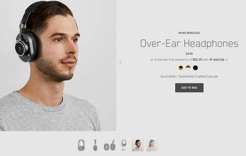
Copy is great and important but every step of your logical navigation and well-paced copy should come with interesting, yet equally effective visuals. If the homepage starts with “Jackson Vacuums – Top-Notch Vacuums for $100 or less,” how about pairing that statement with a professionally shot and incredibly seductive picture of top-notch vacuums that you can’t believe sells at $100 or less (I mean, as seductive a vacuum can possibly be within reason).
When you start to discuss the features and benefits, how about some GIFs or videos that visually backup what you’re saying. When you offer more details to read about, give the option to watch the same content. Sounds like a lot of work? Well, you wanted to know “what are the key elements of a good website?”
I am sure you’re seeing a trend here. There is no wasted effort. Everything serves a purpose and logically pushes the customer through the sales funnel while complimenting the other elements.
What Are the Key Elements of a Good Website? Page Load Time, Duh!
A user clicks on your website. It loads… and loads… and…
That’s it, they’re gone. They are buying some other sexy vacuum. Why’d that happen? Because your page load speed time is just a tad too slow. I’d say every second counts, but in reality, every millisecond counts. So much in fact that “a 100-millisecond delay in website load time can hurt conversion rates by 7 percent.” Yikes!
It’s easy to see why page load time is a key element to a good website. To check your page load time, there is quite a few reliable page load time checkers out there. Some of my favorites are:
For more on page load times, what is a good page load time and how to improve yours, check out What is the Best Way to Increase Engagement on Your Website?
Security + Positive Recommendation = Credibility
One of the most key elements of a good website is credibility. If users don’t trust a website or what they are saying, it does not matter how logical your navigation is, catchy your tagline is or sexy your vacuum photos are (yeah, I’m stilling running with that joke… last one I promise). I follow a simple formula when looking to build credibility and that is security + positive recommendation.
Security
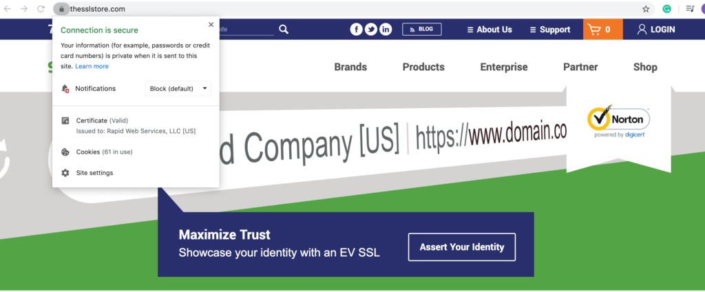
There is no better way to make users feel secure when using your website than an SSL certificate. You know that little padlock in URLs, and you know when it’s not there and it says “not secure,” that’s the difference of an SSL certificate. It’s incredibly important to have an SSL cert in today’s competitive marketplace. And the best part is you aren’t just paying for some worthless padlock that acts as some phony sign of trust.
SSL certs encrypts your website’s communications so that cybercriminals can’t steal sensitive information from you, your business or your customers.
Positive Recommendation
Reviews matter, plain and simple. So, why force users to go jumping around the web to see what people are saying about you? I recommend having some sort of recommendation content directly on your website. This could be:
- Written testimonials
- Video testimonials
- Some type of star rating review system right on your site
- Site seals (such as Better Business Bureau)
I hope I answered the question “What Are the Key Elements of a Good Website?” Best of luck in your journey to create a good (or even great) website.


