Looking at 6 Good UX Design Examples That Will Help You Elevate Your Game
You land on a website and you can’t find the information you’re looking for. You leave.
You try a software product demo and have trouble finding value in it. You don’t buy it.
You click through to a landing page and there is nothing aesthetically desirable about the product showcased on it. You back click right out of there.
The common thread with all of these examples is that the website, software and landing page all displayed a poor user experience (UX). In layman’s terms, it’s the job of a UX designer to ensure that a user has a positive experience when engaging with the designer’s creation. Digging deeper, the UX Designer does much more than this – it is their job to build a fully-functional world around a product that puts the user through a satisfying journey while delivering on their company’s goals.
7 Factors That Affect UX
A popular way to look at UX is with the 7 factors that affect UX or The UX Honeycomb. These 7 factors are useful, usable, findable, credible, desirable, accessible and valuable. Each factor is meant to act as a checklist of sorts – making sure the UX designer can ensure that they nail every aspect of the world and journey they’re building.
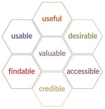
There is no better way to learn how each factor affects UX than with some good UX design examples. We’ve sectioned our examples below into each factor – each example will showcase a specific area of The UX Honeycomb and dive into how they nailed it.
Good UX Design Examples: Usable
Venmo
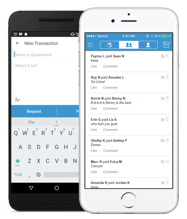
Venmo is a cash app that has a social media component – allowing people to send and receive cash while users can “like” and see other user’s transactions. At the end of the day, the app’s purpose is to allow you to easily send and receive money. That’s where usability comes in.
Usability is all about allowing users to easily and effectively achieve their goals. Venmo allows for money to be sent or received immediately for a small fee or within a few business days for free – giving the user options. It’s also quite easy to find other users on the app. You can find people via a username or sync your phone contacts or Facebook friends, among other options. All of these elements make the usability of the app a good UX design example.
Good UX Design Examples: Findable
Moz Pro
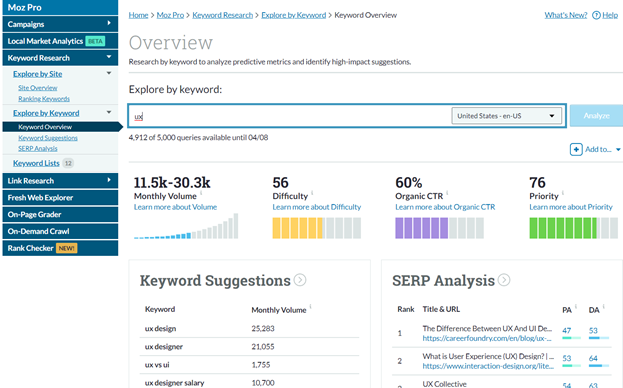
When looking at the UX factor “findable,” you’re trying to decipher what your customers want to find and how to make it easy for them to navigate to it. Moz Pro is a good UX design example of knowing what your common consumer wants to find and how to make it easy to see. You’ll see in the screenshot above that Moz Pro uses a simple left-hand navigation to allow users to easily navigate. As a SEO and content marketer myself, I know what I want, and I want to be able to get to it fast.
There are a few tentpole areas of SEO, such as links, keywords, engaging content, etc. This layout allows users to jump from one key area to another rather quickly and everything is labeled with straightforward and accurate descriptions making for a user experience where findability is clearly valued.
Moz Pro gets two thumbs in the findable category due to their understanding of their consumer’s needs and how to put those needs at their fingertips.
Good UX Design Examples: Useful
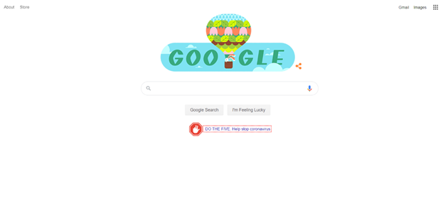
The UX factor “useful” is all about ensuring the product has a purpose and serves that purpose well. There is no better example than Google. It clearly has a purpose – to provide information you seek at the click of a button. They’ve created a business model that rewards people for creating new, accurate and engaging content. They also use an algorithm to weed out unwanted content and drive relevant results to the top.
When the name of your business becomes a commonly used verb, you know you’re delivering a useful experience. Two thumbs up for Google on making “useful” a highly valued UX factor.
Good UX Design Examples: Credible

The SSL Store
Credibility is all about ensuring that users can trust you, trust the information given is accurate and that you can deliver on what is promised. When building trust, there might be no better way than SSL certificates and site seals. It’s a great way to build an interface that gives the impression of credibility.
A good UX design example that shows credibility is the The SSL Store website. As you see in the screenshot above, they have an EV SSL certificate, which verifies who they are and that they value your online security. They also have the Norton site seal further increasing trust and credibility. Even the chat widget in the bottom right-hand corner shows that they care about their customer’s questions.
All of these elements go a long way in building a user experience that denotes credibility.
Good UX Design Examples: Accessible
YouTube
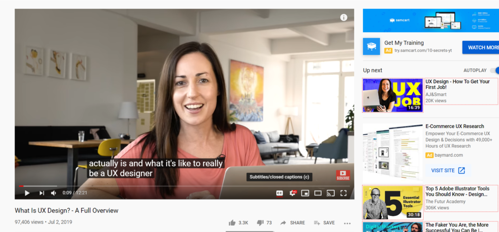
The UX factor “accessible” is all about offering as many capabilities and avenues to users to ensure they are able to have a successful user experience regardless of their abilities or preferences. A good example would be designing both a ramp and stairs that lead to an entrance of a building. People can quickly access the stairs to enter the building or have the option to take the ramp if needed. Making things accessible in UX is no different.
The UX example showcased here is YouTube. YouTube has the option to view their content with audio and/or subtitles. You can also change the font and size of the subtitles. Users have the option to find content via a text search or voice search as well.
It’s these range of capabilities that allows YouTube to be widely accessible to users.
Good UX Design Examples: Desirable
Apple
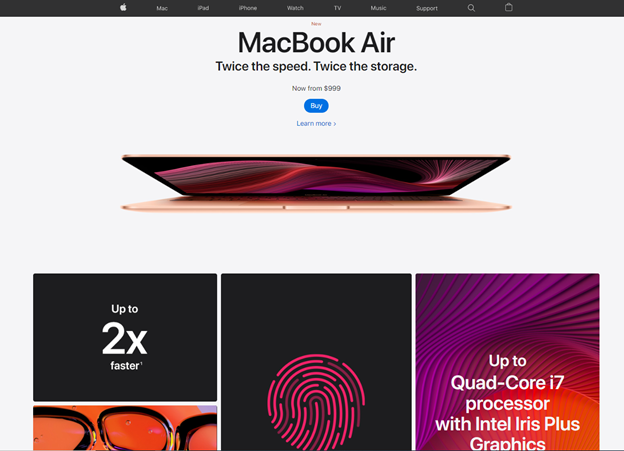
When creating a desirable user experience, you want to meld various visual elements together. Branding, colors, logo, images and bold statements should pop at you but not overwhelm. Apple is a great example of this. Considered by many as the king of product marketing, when entering their website or handling one of their products you can see why. Apple consistently delivers a sleek, clean look with the right amount of color splash – showcasing products with good white spacing and wisely-used text placement and wording.
These well-balanced elements make Apple the ultimate example of a desirable user experience.
Good UX Design Examples: Valuable
The UX factor “valuable” is based on one’s opinion. It depends on what is valuable to you. To deliver value, you need to deliver on all of the other 6 UX factors. It is impossible to know what every single user will find valuable but if you give an all-encompassing, fully-functional user experience where you take into consideration what your costumer’s needs are and what their potential obstacles will be – you will surely deliver a valuable user experience.
There you have it, 6 good UX design examples to learn from for your next project. We hope these examples sparked a new idea or taught you something new. Good luck!


